Contents: (bold ones are finished)
-Forewords
-actions
-crop
-levels & burn tool
-resize
-denoise
-save
Forewords:
There are a LOT of guides for editing manga scans. And most of those guides, while good, are complicated.
http://www.ruinevil.com/rawr/editguide/index.html
http://www.franky-house.com/forums/archive/index.php/f-113.html
So I think there's need for someone telling the basics. Something very simple and clear.
Purpose of this guide is to be able to teach those who have never edited any image before to be able to do basic image editing for scans.
NOTE: In this guide used program is Photoshop. For this guide to be any use for you will need to have a Photoshop as well. Luckily Photoshop is very easy to pirate. (PS CS3 is easiest to crack. And portables don't need cracking) You can get it by torrent or DC++ or from websites. Just google: portable photoshop. (Make sure that version you download supports plug-ins. On other words program has "plug-ins" folder in it's directory.)
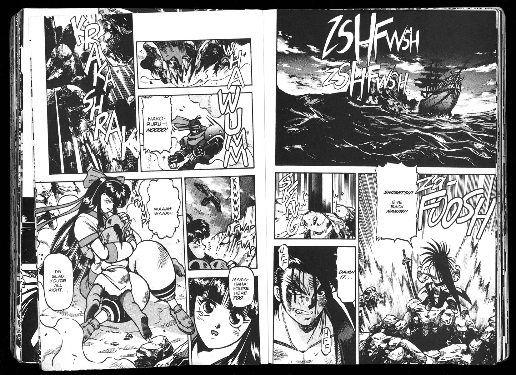
First let's talk about scans. There are good scans and there are bad scans.
BAD
GOOD
GREAT
Definition:
-Great scan doesn't need any other cleaning but crop and levels.
-Good scan will be readable with just crop and levels. Though it would look better with further cleaning.
-Bad scan look like crap with just crop and levels. It should be cleaned in rather time taking way.
¤ACTIONS¤Learning how to use actions is important. In fact it's so important that you should learn it before anything else. This is because using actions can save you from enormous amount of repetitive and boring parts of editing work, as Photoshop can be automated to do most of basic editing for you.
One way to learn is to read Photoshop's help file.
Better way to learn it is to read my illustrated article: Actions, step by step.
¤CROP¤So what is a good crop?
Better question is "What is a bad crop?"
Photoshop's most amazing function is autocrop. It's in: "File>Automate>Crop and Straighten Photos". As the name says it crops and rotates image.
Result of autocrop can be considered as "bad". As there's no point to crop manually to a quality which is worse then what you get from automatic function.
HOW TO CROP.
My previous post already guided for using Photoshop's Crop Tool:
Cropping and cleaning double page
Reading it will teach you basics of rotating and stretching crop area and perspective crop.
To crop to a spread or to single page?
This depends on your artistic preference. And how much you wish to work for it. Obviously cropping to single pages requires twice as much cropping then to spreads. But quite often you will run into scans with misaligned pages and if you wish to release in HQ then in such cases cropping to single page would be a lot less work then cleaning a spread.
Example of misalignment:

Single page
Rectangular crop should work nicely. Just rotate and stretch the crop area.
before
Normal rectangular crop works almost always. After all, pages are rectangles.
rectangular crop
Spread
before
Doing to spread is fast. But in the end it's about whether you crop too little...
after too little cropping
...or too much. Great thing as long as spread is straight.
after too much cropping
If pages are strongly misaligned, you can rotate pages with selection (make selection and press CTRL+T) or with crop tool.
Remember that cropping to single page is usually a lot faster way then doing any cleaning.
Autocrop to spread
I already mentioned this photoshop tool: "Crop and Straighten Photos". Do not ignore it as sometimes it gives simply wonderful results. For example, our two first Di Gi Charat doujinshi releases were almost completely cropped by this tool. So was Cyborg009 v1.
before
Ahh. Sometimes autocrop just works so nicely it would be waste not to use it.
after
Do little quick snip with rectangular crop if you want to add extra quality.
snipped
Perspective crop
This is tricky one. But it is very useful when scanning itself has failed and page shows up as twisted. Exaggerated example: Before>After cropping.
First set crop area imprecisely. PIC Then view page in full size (CTRL+1) and go to it's corner. PIC Now drag corner of crop area to corner of a page. PIC Do the same to other corners. PIC Double click to crop as normally.
Cropping a spread when there's overlapping artwork
In a case of overlap you of course want to crop it to spread.
But if pages are misaligned or there's bad spine, then here's a fast way for: Cropping and cleaning a double page.
(BUT notice that described there is the lazy way! To actually clean and redraw a spread I recommend reading one of the guides linked at the top of this page.)
¤LEVELS & burn tool¤FIRST MAKE SURE YOUR COMPUTER MONITOR ISN'T SET FOR EXTRA BRIGHTNESS AND CONTRAST. Otherwise you cannot level properly as you do not see image really looks like.
Levels
Leveling is the most important part of scanlating. It's located in "Image>Adjustments>Levels"
To read how it actually works from here: LINK
Levels tool can be used many types of editing but in here I will only speak about using it for grayscale images.
Example:
pic before leveling (What should be black, is gray noise.)
Same pic after leveling blacks.
Here's the way I use it:
before leveling
pic1 First I view image at it's full size. (CTRL+1) And start Levels tool. (CTRL+L)
pic2 Then I move black arrow all the way to right to better see gray dirt in image.
pic3 Move white arrow to left to remove dirt.
pic4 Now move black arrow back to left.
pic5 And move gray arrow to left next to black arrow
pic6 Move black arrow to right to remove dirt.
pic7 Then take full view (CTRL+0)
pic8 By moving gray arrow to right you can darken image.
pic9 And by moving it to left image lightens.
after leveling
-Don't try to remove all dirt. As some of it is just very near black or near white tones which has no real effect to what image looks.
-Sometimes you can't (or don't want to) level all the way as that would destroy too much gray. Just level as much as you can and leave it there, or edit it manually (Burn tool).
Another example:
Before
Checking white
I set white to 245
Checking black
I set it to 40
And for gray I chose 1,21. Finished
Between first and last image some of the gray tones were wiped out. To avoid such it's best to be moderate when leveling.
If you wish for better blacks and whites while preserving grays, you need to edit manually.
Burn Tool
With Dodge and Burn Tool you can lighten or darken areas of the image with brush.
You can use Dodge Tool (set to highlights) to wipe out light tones from white areas, and Burn Tool (set to shadows) to turn dark tones to black. Set the exposure low.
(Press SHIFT+O to switch between Dodge-Burn-Smudge Tools.)
PIC1 Let's have a somewhat more difficult image.
PIC2 Here's what normal leveling would result to. Lot of grays would be wiped out.
So I will use Burn Tool instead.
PS1 First I will make Adjustment Layer Levels to change the way image shows. It makes easier to check if you have missed any spot. (Change mode first. Image>Mode>RBG) Layer>New Adjustment Layer>Levels
PS2 Douple click layer to change settings.
PS3 Now let's burn.
PS4 Burned.
PS5 Now I will use adjustment layer to check result. Looks like I missed a spot.
PS6 Here we go.
PS7 I personally prefer to use Burn Tool for removing white dirt too. Simply invert image (CTRL+I) and white is now black. When finished invert again. Put that's just my personal taste. Use Dodge Tool if you prefer.
PS8 Done but there are still those mistones on grays.
PS9 You can use Burn and Dodge for that as well.
PIC3 Here we are. Cleaned with burn tool. Compare to the pic2.
¤RESIZE¤Notice: Photoshop can not resize properly if mode (Image>Mode) is set as "indexed color". And PNG images are usually indexed color. So if you are resizing PNG image then make sure that mode is set as something else, like RGB color.
Keep "Resample Image" as bicubic. (I have tested other choices and they do not give better results.) Make sure "Constrain Proportions" is selected. PICChange image size by changing value of height or widht or by setting a percent value. (that's in drop menu under word "pixel") Resize marks. Those are easy to get rid off with denoise. <>
¤denoise¤
Do not use Photoshop's denoise. Ever. It has to be the worst denoiser in existence. Use plug-ins instead.
As for plug-in denoisers, I'm only familiar with topaz vivacity and topaz labs. (good and easy to crack.) There are
other good ones but as I haven't tested them I can't give any
recommendation.Using denoise filters.LQ picture improving: Before > after dejpeg > after denoiseRemoving resize marks: Before > After. (topaz vivacity denoise) Enlarging and enchance: Before > After. (topaz enlarge and topaz enhance)
¤SAVE¤
Reason to save with PNG:
When image is in PNG, it can be opened, edited and saved multiple times without loss of quality (Unlike JPG image which suffers inevitable loss quality each time.). This is essential in scanlating as there's always a chance of release will be re-edited later.
Nevertheless, saving in PNG-24 (color) causes so large filesizes that it's practically never used.
So, color images are saved to JPG, with as little saves between scan and final save as possible.
Grayscale images are usually saved with PNG-8 (grayscale).
How to save to JPG format:
Save with jpg plug-in. (For example ProJPEG) That way you can see preview of compressed image as well as it's estimated filesize.
How to save to PNG-8 format:
Go to File>Save for Web & Devices
Select from settings "PNG-8" "adaptive" "no dither" "interlace=off" (PIC)
Number of colors depends what is being saved.
For example this picture:
http://kickthekitty.files.wordpress.com/2010/09/20100925c26extrajaaldarya4.png
has to be saved with at least 128 colors.
Where as this one:
http://kickthekitty.files.wordpress.com/2010/09/busou-renkin-v5-p097.png
can be saved with just 8 colors.
Difference is continuous-tone. First image has such and needs lot of colors to keep grays smooth.
The second image is composed from lines and dots. And therefore only 8 colors are enough to preserve artwork. (8 colors seems to be lower limit as any less would result for jagged lines.)
Here's Berserk as example.
With 2400px size grays are composed from dots so using just 8 color is possible.
http://kickthekitty.files.wordpress.com/2010/09/berserk-v31-p072.png
When resized to 1200px size (and topaz vivacity denoise) grays are now continuous. So at least 16 color are needed. 32 colors recommended.
http://kickthekitty.files.wordpress.com/2010/09/berserk-v31-p072small.png
(writing will continue...)
|


